Imagery is a key part of any successful web design but sourcing graphics, illustrations or photography can be tricky if you’re not a designer, marketer or editor. Don’t worry – it’s not necessarily as complicated as it might seem.
This is a practical guide to finding, editing and optimising images for your accountancy firm’s website. It covers everything from tips on editing software to suggestions for where to find good quality, free images that you can use, as long as you take certain precautions.
Before we get into it, though, here’s a quick glossary of useful terms:
- Compression – reducing the size of a file without changing its dimensions or proportions.
- Cropping – cutting out a section of an image to emphasise a detail, change the proportions, or remove unwanted details from the edges.
- Filesize – how much space a file (in this case, an image) takes up on a drive or disk.
- JPEG – a file format that uses a complex algorithm to remove unnecessary information from an image so that it takes up less space while still looking more-or-less the same on screen. Excellent for photos but can struggle with logos or illustrations.
- Kilobyte (KB) – a unit of data. The more kilobytes, the bigger the file, and the slower it loads.
- Optimising – the process of tweaking an image for online use.
- Pixels – a single dot of light on a computer screen. Images for the web are measured in pixels rather than millimetres.
- Resizing – reducing the dimensions or proportions of an image, which will also usually reduce the filesize.
- PNG – similar file format that works best for graphics with large blocks of colour or bold illustrations.

A typical illustration from the PracticeWeb blog, using stock imagery with an added brand element.
Sourcing photos and working with stock
In an ideal world, every accounting practice would have an endless marketing budget and spend a chunk of it on commissioning bespoke photography.
Honestly, it’s not even that expensive – paying a photographer for a day or two’s work might cost a few hundred pounds and provide you with enough pictures to last two or three years, as long as you give a good brief.
In practice, though, for reasons of budget and speed, most of us – and most media outlets – rely on third-party ‘stock photography’ libraries.
The stock industry has been around since the early 20th century and operates on the basis of photographers taking pictures on spec and then licensing them for use in newspapers and books, and on websites, via companies such as iStock or Shutterstock.
Stock used to be prohibitively expensive for most users but 21st century technology – online search engines, the rise of digital cameras – has made it both simpler and cheaper.
For example, Adobe Stock, operated by the company that produces the world-standard image editing software Photoshop, offers a subscription package for around £20 per month which includes 10 images each month. That’s more than enough for most accountancy firm websites.
If that’s still too rich for your taste, there are also some excellent free stock libraries such as Unsplash. Just be aware that the selection of photos is limited and that the terms and conditions can be a bit fiddly to navigate – but I’ll come back to that later.
First, let’s talk about good taste.

A typically cliched accountancy image from iStock.
Avoiding cliches and cringes
There are a few reasons stock photography has a bad reputation, especially among designers.
First, certain specific photos turn up time and time again, simply because they’re at the top of the search results for particular terms, such as ‘business’ or ‘tax’.
There are also certain visual tropes that get used over and over: calculators, piggy banks, people in suits pointing at laptops, coin-bearing trees growing out of nest eggs, and so on.
Certain trends in stock photography also come and go and it’s easy to end up choosing pictures that looked cool in 2010 but now seem, frankly, a bit cheesy.
For example, a few years ago, lots of photos featured lens flare and heavy colour processing, which is now very much out of fashion.
Speaking of cheese, you’ll probably also want to avoid:
- dogs in hats
- babies dressed like business-people
- over-emoting models holding their heads in despair
- older people dressed as punks or rappers
- unnaturally beautiful models
- cyberpunk computer interfaces.
That still leaves a lot of options, though, and one way to help narrow down your options, and find the good stuff, is to come up with a visual strategy.

An extract from the UK Business Forums brand guidelines.
Visual strategies
For example, our sister publication UK Business Forums, which employs stock photography in its editorial content, has an underlying style that relies on slightly abstract images of people at work, or particular products – hands rather than faces, viewed from overhead or from some other unusual angle. The idea there is to convey practicality and realness.
To enhance this sense of practicality, consider incorporating some advanced editing techniques such as background erasing. For example, using tools on platforms like PicsArt, you can effectively eliminate distracting elements from the background, bringing the subject into sharper focus. This not only underlines the subject reality but also makes the image more aesthetically pleasing, contributing positively to the overall design and feel of the accountancy website.
Here on the PracticeWeb blog, we try to use photographs we’ve commissioned or taken ourselves. Otherwise, we select the most natural looking stock images we can find of people who might be accountants or their clients. We add the colourful circles that are part of our brand design added where appropriate.
Other possible approaches include:
- local focus – regional landmarks and landscape
- restricted colour palette – yellow, say
- vintage imagery – like this
- black-and-white or split-tone photos
- editorial illustrations – instead of photos
- text illustrations – words against blocks of colour.
Here are some examples of visual strategies we’ve devised for our web design clients:
- Munro & Partners – relaxed beauty
- Rise Audit – rebel energy
- Hurkans – London, catering, a Mediterranean flavour
You don’t always, or only, have to use images that match your strategy – it’s just a helpful anchor that will keep you on track and give a consistent feel to your website.
When it comes to visual strategies for accountancy in particular, PracticeWeb advises its clients to avoid cliches (see above) and to try taking a more abstract approach.
One trick that works well is to look for the most interesting word or idea in your blog post and make that the focus for your image.
For example, if you mention exports, find a cool picture of a cargo ship; or if the piece covers VAT for catering businesses, use a nice shot of a delicious-looking restaurant meal, or a flaming grill.
Much more exciting than some coins on a desk.

An eye-catching photo by Louis Hansel of a chef in action, via Unsplash.
Using free stock photo websites safely
These days, there are some excellent free stock libraries with good quality images and super clear licencing terms.
Unsplash, for example, has an overall description of the terms under which you can use the images:
“All photos published on Unsplash can be used for free. You can use them for commercial and noncommercial purposes. You do not need to ask permission from or provide credit to the photographer or Unsplash, although it is appreciated when possible.
“More precisely, Unsplash grants you an irrevocable, nonexclusive, worldwide copyright license to download, copy, modify, distribute, perform, and use photos from Unsplash for free, including for commercial purposes, without permission from or attributing the photographer or Unsplash. This license does not include the right to compile photos from Unsplash to replicate a similar or competing service.”
In other words, as long as you don’t bundle them up and sell them on, you’ve got pretty much complete freedom, even to use the photos in commercial projects.
Similar libraries are available, under similar terms, from Pexels and Pixabay.
But there are a few caveats.
First, select your images carefully. Just to be on the safe side, we’d suggest avoiding:
- trademarks, logos, identifiable shopfronts, etc
- recognisable individuals, with faces visible
The latter is important because it can be hard to know for sure that the people featured in these free photos have signed the necessary permissions.
They probably have, or maybe don’t care, but just to dodge any potential difficulty down the line with someone popping up from San Francisco to ask why their photo is on a UK accountant’s website, give it a swerve.
What you absolutely shouldn’t do is take pictures from Google Image search, most of which are under copyright; or from sites such as Flickr, where each image has its own licence terms.
Even if an image looks free to use under a Creative Commons licence, for example, you’ll usually be required to include a credit. Some versions of the licence will also forbid commercial use (and accountancy firms’ websites are definitely commercial) or adaptation – you couldn’t crop, recolour or otherwise change the image.
Again, if you’d rather be 100% confident and safe, paying for access to a professional stock library is the surest option.
Optimising for online use
When you download an image from a stock library, free or otherwise, it will generally come as a very large, high-resolution image unsuitable for use on a website or blog post.
Large images take longer to download and sites that take longer to download perform worse in Google search rankings, so there’s an absolutely pragmatic reason to get this right.
As a rule, you’ll probably want featured images to be something like 1024 pixels wide and standard in-post pictures to be more like 650 pixels. (More on pixels in a minute.) You’ll also want them compressed, as JPEGs or PNGs, to less than 100 KB.
If your website is hosted on our Horizon platform, the good news is that the process of resizing and compressing for the web is mostly automated, as long as the image you start with is smaller than 500 kilobytes in size.
When you upload an image, Horizon uses a built in compression tool to make them smaller without reducing their quality in any visible way, then creates multiple versions of the file at different sizes.
To find out more, check out the detailed guide to adding images using Horizon on our customer support pages.
Doing it yourself
If you need to optimise the images yourself, don’t worry – that’s easier than ever these days.
Ideally, you’d use Adobe Photoshop, the design industry’s standard image editing software. It’s pretty expensive, though, and for most people, over-complicated, with too many features.
Some free alternatives include Pixlr and Photopea, both of which essentially run clones of Photoshop, with limited features, in your web browser; GIMP, which is a complex, fully-featured piece of free software; or, on your smartphone, apps such as Google’s own Snapseed (Android | Apple iOS) which lets you choose all sorts of export settings.

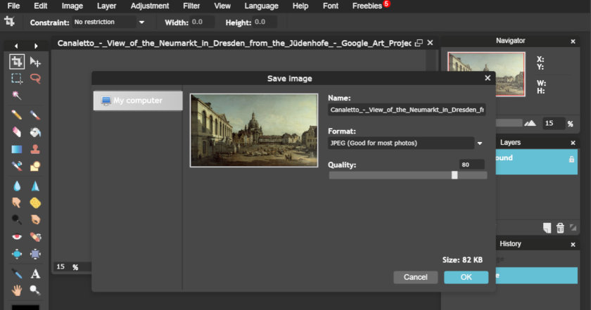
Editing and exporting in Pixlr.
Pixlr – go to pixlr.com/editor; select ‘Open image from computer’ and load the photo you’ve saved to your hard drive; under the ‘Image’ menu select ‘Image size’ and choose, eg, 840 pixels and then click ‘OK; then, under the ‘File’ menu choose ‘Save’ and follow the onscreen instructions to create a compressed JPEG version of your photo. (For Photopea the process is the same except it’s File > Export as > JPG.)

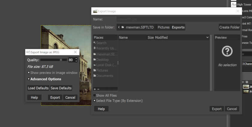
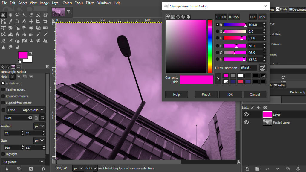
Editing and exporting in GIMP.
GIMP – here’s the official guidance on how to use GIMP for image exporting but, in brief:
- Open your image.
- Under the ‘Image’ menu, select ‘Scale image’.
- In the menu that appears, change the width to, eg, 840 pixels. The height should adjust automatically to match. Click ‘Scale’ to apply the change.
- From the ‘File’ menu, select ‘Export as’.
- Choose where you want to save the new image and enter a filename including such as canaletto.jpg. Adding ‘.jpg’ at the end is important.
- Another menu will appear. In that, set the quality to 80% and then click ‘Export’.

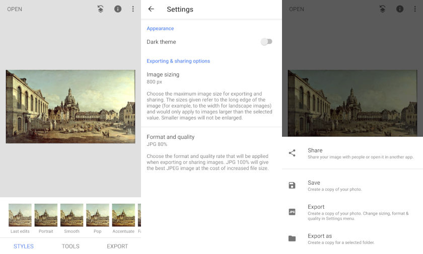
Editing images on an Android smartphone with Snapseed.
Snapseed – in settings, under the three dots at the top right, select 800 px under ‘Image sizing’; and JPG 80% under ‘Format and quality’. Then open your chosen image, hit EXPORT and choose ‘Export’ from the menu that pops up. That will create a version of your image suitable for the web and save it in the same folder on your phone.
And remember, when you save your images, make sure to give them meaningful filenames – ‘cargo_for_export.jpg’ rather than ‘img39un1_x.jpg’. And when you upload them to your website, make sure to set useful, accurate alt tags. This not only makes everything clearer and easier for you but also for users. It can make a small contribution to your search engine performance, too, and every little helps.
Scratching the surface
You’ll have worked out even from this quick guide that editing images is fiddly and, like accountancy, generally best left to experts.
If you have the budget, paying a graphic designer to do this for you, or sending a member of your team on a proper course, might be a worthwhile investment.
Talk to us about web design and brand identity.


