“Working with PracticeWeb has been a hoot. Nothing less than really good fun. If one gives over completely to the process – and it really is a process – then it can get really get quite creative.
“What has emerged is really quite impressive. They have a multi-layered team and many, many heads get involved. I recommend them highly.”
Robert Stell
Rise
Rise seeks to break the mould in audit – an under-fire industry that’s been rocked by several high-profile failings of late – by taking a more collaborative and client-focused approach than that of a traditional auditor.
Based on those core ideas of treating clients fairly and doing something different from the rest of the industry, we built a new brand to challenge the market.
Our account director, Alex Tucker, worked closely with co-founder Robert Stell to create the brand. Here’s what he had to say about the project:
How did the project start?
Robert came to us because he was trying to attract audit clients, but didn’t know why it wasn’t working.
It was very apparent that his existing business was much more geared towards microbusinesses than the financial directors or chief financial officers who are most likely to look for a new audit supplier.
These people have very different needs, and a different approach to buying. The content and branding Robert had on his website was just not right for them.
We ran a workshop to help him understand the needs of his target market. In that process it became clear that more than wanting some audit clients, Robert had a core belief that smaller audit clients were being treated badly.
Everyone involved in the project felt that belief could be built into a challenger brand, reaching out to people who wanted a better audit service.
What did you do next?
That theory needed to be tested to make sure it really did chime with potential audit clients, so we carried out a series of interviews with senior finance professionals, asking each person questions about their experience of audit.
We got some really interesting responses, and many of them backed up the main assumptions behind the brand. Several interviewees told us they didn’t feel valued or understood by their auditor, and that they would like a more collaborative approach.
Where did the name ‘Rise’ come from?
A huge amount of thought went into naming the brand. We needed a name that would sum up the key concepts behind the brand, and would stand out in the market.
We put together a lot of ideas, and narrowed them down using a series of tests, examining everything from what they could mean, to how they looked on paper, to how they sounded out loud.
Eventually, we reached a shortlist of three to present back to Robert – and Rise stood out as the best option. It suggests the sense of rebellion, of rising up, that’s at the heart of the brand, but it denotes positivity and progress too.
How did that tie into the brand design?
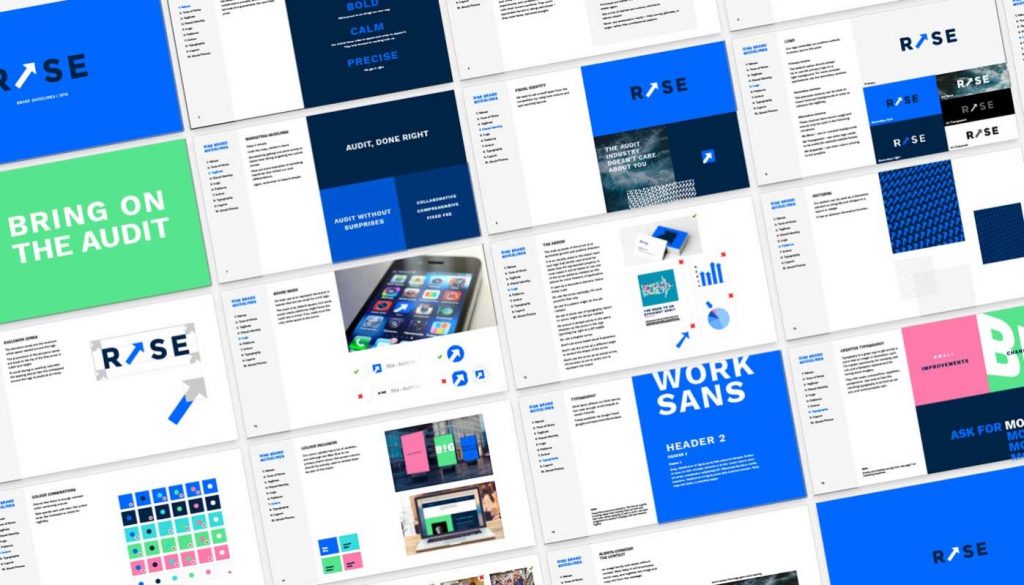
We took all the non-visual stuff – the brand values, its point of difference, everything that came out of the branding workshop – and made it visual. See the visuals on the Rise case study page.
We gave it a look and feel, a logo, fonts, colour pallette and photography. Then we put all of those elements into a set of brand guidelines, which really helped to make it cohesive, and focus all of the different people involved on the same goal.
What about the content?
We started by working with Robert to set out his objectives for the content. It needed to be challenging and invite engagement from potential clients, but it also needed to be relevant and useful to them.
We drew up a 10-point manifesto that aligned with the content objectives, to provide a framework for new content.
Planning out the content led to talking about other forms of media, and as the web production phase approached, Robert had the idea of creating a series of videos to build up to the brand launch.
We helped him to produce six short videos, working with an external film studio to shoot and edit them.
How did the website development process work?
The website was a great place to start pulling all of these elements together, and executing on all of the strategy and design work we’d put in. The brand work informed both the visuals and the copy, so Rise’s impactful, bold messaging was carried across.
We tied in key statistics from the research, and used Robert’s videos throughout the site to back up that message.
See the visuals and journey we went though with Robert on our Rise case study page.
You can visit the Rise website here.
Talk to us about how we can help create an effective marketing strategy just for you.
Like and share this post using the buttons below.


