Accounting websites: the complete guide
How website structure, design and usability can help your practice stand out, generate leads and grow
Updated 2022 edition
Our most comprehensive guide yet, covering everything you need to know to get the right website for your accountancy firm – one that will help you meet your business and marketing goals, achieve maximum return on investment and stand out in the marketplace.
If you’re an accountant setting up your first practice website and keen to start generating leads, or represent an established accountancy firm that’s ready to grow, this updated 2022 edition of the ‘Complete guide to websites’ is for you.
By the end of reading it you should be able to understand:
- What does a good accountancy website look like in 2022 and beyond?
- What role should SEO play?
- How should you plan and layout copy and content?
- How should you measure return on investment?
Read an advice-packed sample of the guide below or go straight ahead and download the complete eBook.
If you’d like to know a bit more about how we can help you, have a look at our web design for accountants service.
Download the eBook
This guide was created by the PracticeWeb team.
Introduction
If you’re an accountant setting up your first practice website and keen to start generating leads, or represent an established accountancy firm that’s ready to grow, this PracticeWeb complete guide to websites is for you.
A website should always be designed to serve your business goals – it’s a functional tool that needs to deliver a return on your investment.
We hope our guide will make you a smarter buyer, help you ask the right questions and highlight some issues to be aware of in this particular specialist market.
With technology always changing, if your website is stuck in the past your potential new prospects may well think your business is too.
This guide is one of our most comprehensive yet, covering everything you need to know to get the right website for your accountancy firm – one that will help you meet your business and marketing goals, achieve maximum return on investment and stand out in the marketplace.
Do we need a new website?
The straight answer here is yes – you need a website if you have any intention of attracting new clients and nurturing existing ones.
In the 2022 post-pandemic world, having a robust and engaging digital presence has never been more important. Where having bricks-andmortar premises once served to attract new clients, or a social media presence was enough to drive leads, a website is now key to attracting new business.
In 2019, a survey by the AI company Glass found that only 30% of registered UK businesses had a website, although this varied a little by sector. While this is likely to have changed a bit in recent years, it still means there’s a huge number of companies out there without an optimised core for generating enquiries.
The world of accounting has changed markedly over the last few years, too. It’s moved away from simply maintaining your client’s books and submitting them to HMRC every year, and towards a full-spectrum digital advisory service that incorporates cloud-based accounting software and a deep understanding of your clients’ businesses.
This means your website is more important than ever, especially as more and more millennials and Gen Z-ers come of age and start businesses of their own. The current generation’s buying habits are increasingly digital, a trend only accelerated by the pandemic.
That’s something to keep in mind not only for attracting new clients, but also for attracting new talent – to maintain a modern culture and bring the right staff into your firm, you need to appeal to the younger generations as a workplace.
So, in addition to needing a website to get in front of this expanding market, you need to have a site that conveys expertise, authority and trust.
According to Google, customers get up to 60% of the way through the buying process before they’re ever ready to pick up a phone and talk to anyone. This is all pointing one way: you need a website, and it needs top-tier content.
Ok, but do we need a new website?
That depends on a few things: how old your current website is, whether it’s achieving what you want it to, and whether your goals and priorities have changed since it was built.
Trends in design change over time, of course, as do the expectations of business-to-business buyers, and the technology we use to access information.
For example, hardly anyone was browsing on mobile devices a decade ago. Now, mobile accounts for approximately half of web traffic worldwide. In the fourth quarter of 2021, mobile devices (excluding tablets) generated 54.4 percent of global website traffic.
With all that rapid change going on, it’s very easy for a website to look out
of date and tired. But also, standards change – what was technically fit for purpose then won’t be now.
For example, web designers used to strive to design pages that would fit within certain standard dimensions to suit desktop PC monitors. They would also bend over backwards to avoid making users scroll because received wisdom was that content ‘below the fold’ was likely to be ignored.
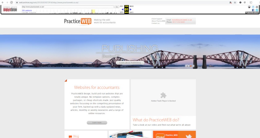
How our own website looked in 2012. Yikes.
Take the PracticeWeb website from 2012, pictured above thanks to the magic of the Wayback Machine, as an example.
It was designed so that the main content would fit within an 800 pixel wide space, hence all that grey at either side, and used a Flash plugin – now seriously out of favour for various reasons.
What was best practice then, and sent a signal to users that this was a professional, modern website, now makes a website look tired.
And that’s before you even get into the expectations of search engines.
Here are a few quick tricks for working out if your website needs attention, without getting bogged down in technicalities.
- Gather inspiration. Get together a list of websites you like – and not just accountancy firms. Break down what you like about each and the values you think they put across.
- Review the competition. What are your immediate competitors doing well? What are they doing badly?
- Then look again at your own existing website. Are there annoyances from your competitors’ websites which you’re also guilty of committing? Are there things the websites you like are doing that yours isn’t?
What does a good accountancy website look like in 2022 and beyond?
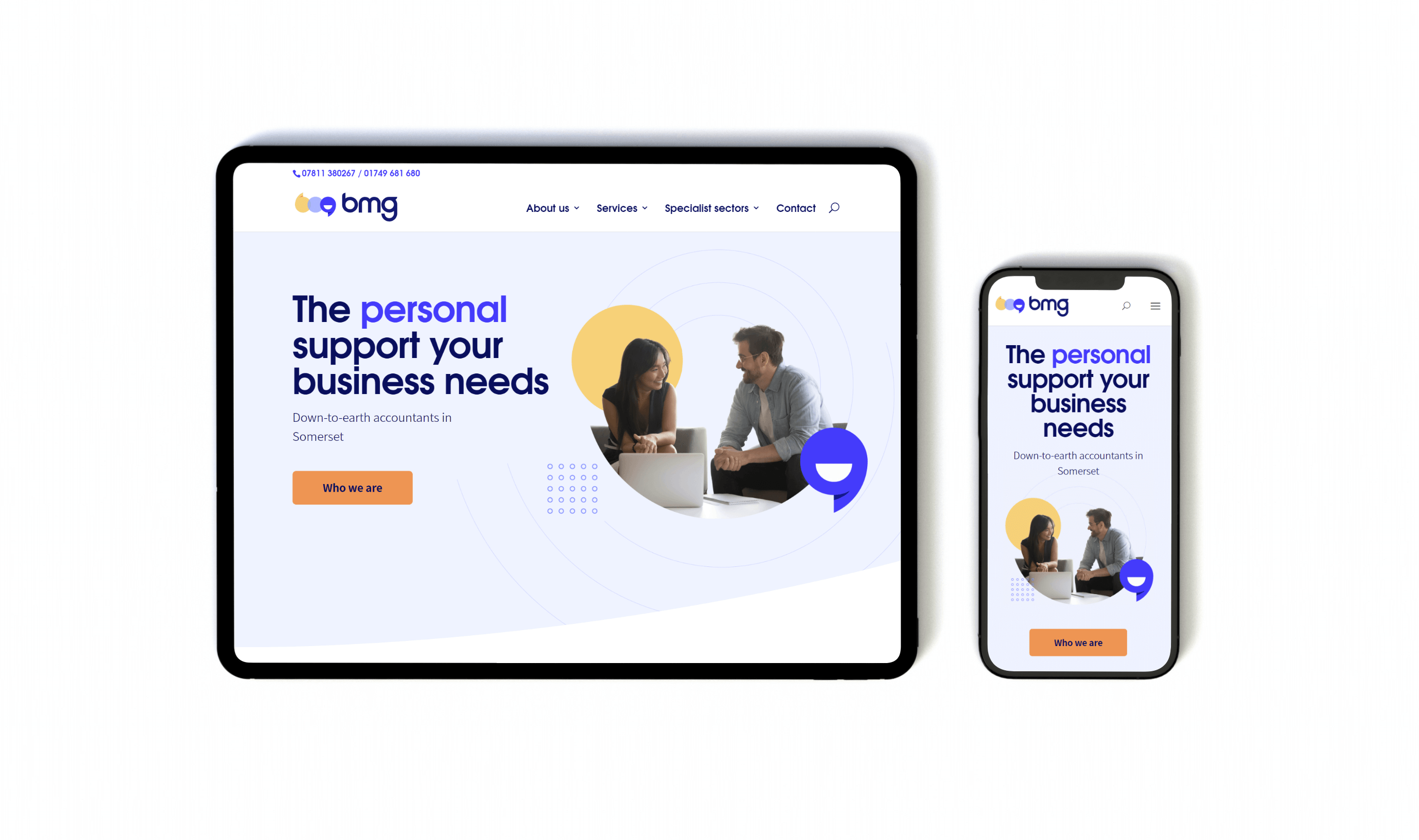
BMG on iPad and iPhone
To be effective and appealing to clients, your website needs to meet a basic set of best practice requirements.
First, it must be responsive. Responsive websites adapt to whichever device they’re being viewed on, rearranging and resizing content on the fly to ensure it always fills the screen.
This is important not only because it looks better than tiny text or tons of blank space but because of how Google assesses the value of websites.
During 2018, Google started rolling out mobile-first indexing which uses the mobile version of your website when ranking your content. If your site isn’t mobile friendly, or you have a separate mobile version of your site, it’s likely you’ll rank lower.
Pages on a 2022-ready accountancy website are also more likely to have a carefully chosen set of pages with substantial content that requires a bit of scrolling on the part of the user rather than hundreds of separate pages with only scraps of text.
As one of our designers wrote on the PracticeWeb blog:
“Current [user experience] thinking is that users are happy to scroll – think about what it’s like to use Facebook, Amazon and Twitter these days – but if more than one or two clicks are required to find the page they need, or the copy makes it hard to work out what’s where, they’ll get frustrated.”
Of course it’s complicated: research from Nielsen Norman Group suggests that ‘above the fold’ content still has more value.
What a good web designer can do is use that prime real estate to hook a user’s attention and then design an interface that draws them down the page, into the content, towards a contact form or other conversion.
Behind the scenes, any decent website these days will have a content management system (CMS) which gives you, the website owner, the power to add, remove and edit content quickly and easily. You certainly shouldn’t be emailing change requests to a remote ‘webmaster’ and waiting days for them to filter through.
You’ll also want to have HTTPS encryption. The S in HTTPS stands for ‘secure’ and HTTPS is effectively a seal of approval guaranteeing the safety of the connection between a user’s browser and the website in question.
Stats from Google suggest that desktop users load more than half of all web-pages they view over HTTPS and that they spend two-thirds of their browsing time on HTTPS pages.
If your website address begins with HTTP rather than HTTPS, not only will users feel less confident in the safety of your site but you might also find that Google ranks it lower.
Search engine optimisation (SEO)
Search engine optimisation (or SEO to its friends) is the process of developing website content, back-end set up and links to encourage Google and other search engines to rank your website higher in search results.
The process is often regarded as a bit of a dark art but, implemented correctly, it can produce a consistent stream of really high-quality traffic full of users ready to convert into leads.
There’s a direct correlation between how your website ranks in search engines and the amount of visits it gets, and then how many of those visitors go on to become leads. Users see higher ranking as a trust signal, which encourages them to click on your link and head to your site.
The key to getting SEO right is finding the right partner to work with. There are a lot of self-professed SEO “gurus” out there with an approach to SEO that can be actively harmful to your site. You need to find a partner who knows you and your industry, combined with a deep understanding of current SEO best practice.
Once upon a time it was enough to stuff your page content full of keywords and spammy links in your website footer, but things have moved on a lot since then.
Now SEO is about content quality, and how that quality meets the needs of your users. The Google algorithm is now incredibly complex and is more than capable of reading your website content and working out how it relates to your users.
To get the most out of your SEO you need to first discern what keywords you want to rank for, what assets you have that can rank for them and then how to align the two so that your content surfaces in relevant searches. This is where SEOs come in. Working out the relationship between the two is an art in itself and, while you can do this yourself using tools like Google’s keyword planner, an expert can lend real value here.
It’s not just your content that will determine your ranking in search engines; there are a myriad of other factors that go into making an SEO friendly web presence. Some are as simple as making internal links to your service and sector pages, and some are a lot more complex, like working out canonical tags and page indexing.
Whether you choose to brave it alone or take advantage of our in-house SEO team, there has never been a better time to get online and start optimising your site, and then watching those leads roll in.
Website architecture and structure
Function dictates form, not the other way round.
Architecture refers to how the information on your website is structured, including hierarchy and connections between items of information. It’s fairly abstract and technical but overlaps with the more practical business of website structure.
Structure refers to concrete questions of which pages you have on your website, how they’re organised and interlinked, and how they’re displayed in the navigation.
When we’re building websites for clients, this is often where we start, compiling a list of the information we have and want to convey, and then sketching out a structure.
As a rule, avoid coming up with a clever-clever structure for the sake of being different. Certain conventions have arisen purely because they work for users and provide familiar reference points to help them on their journey.
For example, eCommerce websites often have a big search box at the top and centre of the screen, because user testing over the years have shown that people expect it to be there.
In the case of accountancy websites, though there aren’t quite the same well-rehearsed expectations, certain elements of good practice have emerged.
Think of the dream client visiting your site for the first time – what do they want to find?
Well, first, they might want proof that you offer the specific accountancy service they’re looking to acquire. In which case, it’s important to have information about your offer on your homepage.
Then, assuming they want to know more, they need to be able to find a more detailed note on exactly what your service includes without hunting around. In practice, that probably means an element in the navigation bar that says ‘Our services’, or some close synonym, linking through to individual service pages.
If you work across multiple industry sectors, a ‘Sectors’ menu is also a good idea, directing prospects to individual pages demonstrating that you really do know their industry and explaining how you tailor your service to its particular requirements.
Or let’s say they want more general proof of your expertise and experience – what will they be looking for? Partner profiles on a ‘Meet the team’ page under ‘About us’, perhaps, telling a compelling story about how your team developed its unique mix of skills.
Maybe they want to know about your firm’s culture – do you share their attitudes? Are you the kind of people with whom they can do business? This is where ‘How we work’ or ‘Our approach’ comes in, setting out a philosophy and approach.
And if they just want to get in touch, there has to be an obvious place to ‘Contact us’.
That’s just a snapshot of some of the key sections your website might need. Depending on your firm’s specialisms, you might need more pages, or fewer.
Another general rule: in terms of SEO, the more pages the better, within reason. The more text you provide, the more there is for Google to get to grips with, and the more likely it is that you’ll meet the needs of users who have come to your website looking for information or answers.


