Creating a tone and style that talks to a target audience
The client
Hurkans is a firm of accountants in north London specialising in catering and retail. The project was managed by business consultant Martin Prescott.

Team


The challenge
Business consultant Martin Prescott managed the process on behalf of Hurkans. He says:
“Hurkans’ old website had become woefully out-of-date. It wasn’t mobile accessible – it didn’t really work on smartphones – and it didn’t convey the image of the kind of firm it had become.
The problem is, as with many firms, serving clients always has to come first before marketing. Everyone knew it needed updating, but it just kept getting pushed down the list of priorities.
The immediate trigger was the arrival of GDPR last spring but it was long overdue.”
How we helped
1 | Mobile responsive
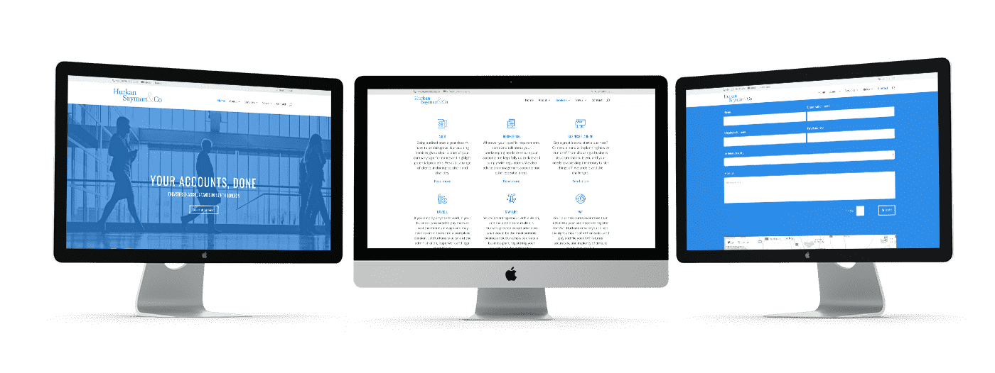
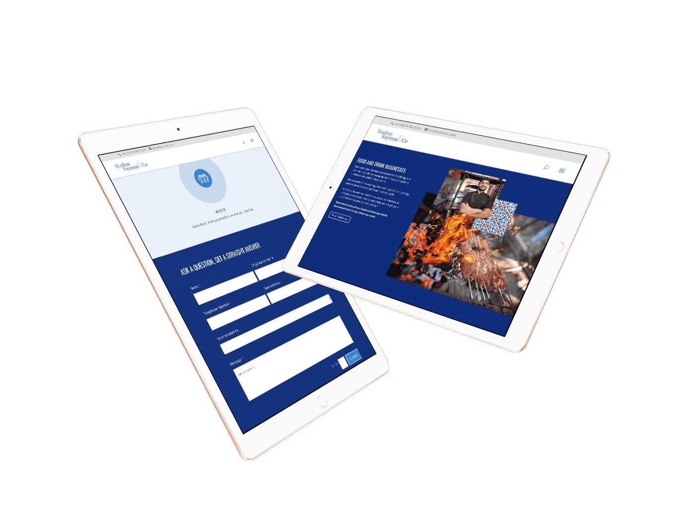
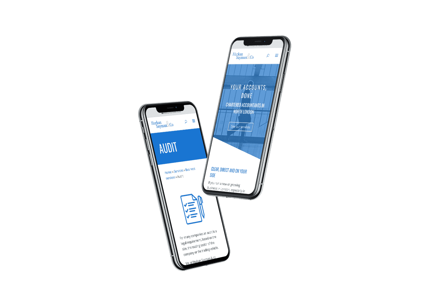
Moving Hurkans onto our new Horizon platform immediately improved the mobile responsiveness of the website, and brought it up to modern technical standards.
2 | Tone of voice & style
Our designers and copywriters then worked with Martin to define a tone of voice and visual style that would convey professionalism and directness, while maintaining a human feel.
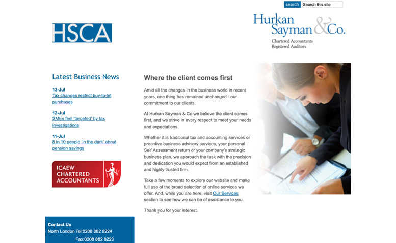
Before redesign
Not mobile responsive
Logo on right of page
Poor navigation
Not mobile responsive
Logo on right of page
Poor navigation
Obvious stock imagery
Looks out of date
Poor use of colour
Visuals

Colour palette
Illustration Library
Large illustrations
abcdefghijklmnopqrstuvwxyz
ABCDEFGHIJKLMNOPQRSTUVWXYZ
Typography


Photography
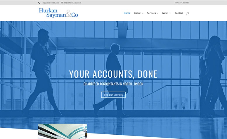
After redesign
Mobile responsive
Logo top left
Clear navigation
Mobile responsive
Logo top left
Clear navigation
Curated imagery
Modern and fresh
Good use of colour
“It’s been a learning process for me, too, seeing how you guys approached this task, and I’ll keep PracticeWeb in mind when dealing with future clients. Why would I go anywhere else?“
– Martin Prescott
